SalesConnect
Designing for brand consistency, simplicity, and functionality
Project Overview & Goal
• Role: Product Designer for SalesConnect pages (A centralized platform for sales content and training at Cisco)
• Company: Cisco
• Tools: Figma, SalesConnect, Click Up
• Timeline: 4 months
The goal was to rein in the chaos that was SalesConnect to enhance the performance and user experience by conducting a website audit and providing strategic recommendations. This involved streamlining content, aligning design with the style guide, and applying UX best practices to reduce user frustration and improve the accessibility of key features.
Problem Statement
The internal Salesforce tool, SalesConnect, faced significant usability challenges due to a cluttered and inconsistent design. Key issues included irrelevant imagery, excessive and scattered content, non-compliant colored buttons, and outdated information, all of which deviated from the style guide. These design flaws led to user frustration, making it difficult for users to efficiently access critical content. To address this, a comprehensive website audit was conducted, followed by strategic recommendations aimed at streamlining the user experience and improving the performance of existing features. It was evident that fundamental UX principles needed to be applied to enhance both functionality and user satisfaction.
Research & Ideation
For the SalesConnect project, I delved into our internal design system guidelines and presented them to stakeholders, communicating the design vision and aligning goals. Rather than relying on traditional pen-and-paper ideation, I actively engaged with the SalesConnect platform through hands-on exploration, collaborating closely with developers to bridge technical constraints with design objectives. This approach not only fostered familiarity with the tool but also built strong connections between design and development teams, ensuring a cohesive and feasible design solution.
Wireframing
Creating wireframes using conventional methods was not suitable for this project due to the tool’s limited capabilities. By joining multiple team spaces within SalesConnect, I found a network of mentors who guided me through the process of rebranding the SalesConnect pages to align more cohesively with Cisco.com. My primary objective was to eliminate the disjointed and inconsistent design elements, refining the excessive use of colors to create a more user-friendly experience. Although I captured before-and-after comparisons for my portfolio, confidentiality constraints prevent me from sharing them here, but I’ve included a few samples for reference.
Some Before and Afters'
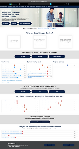
Before Design changes - LCS
Multiple primary buttons
Content densely packed into cards with poor UI design
Lack of clear content hierarchy and design across the page
After - LCS

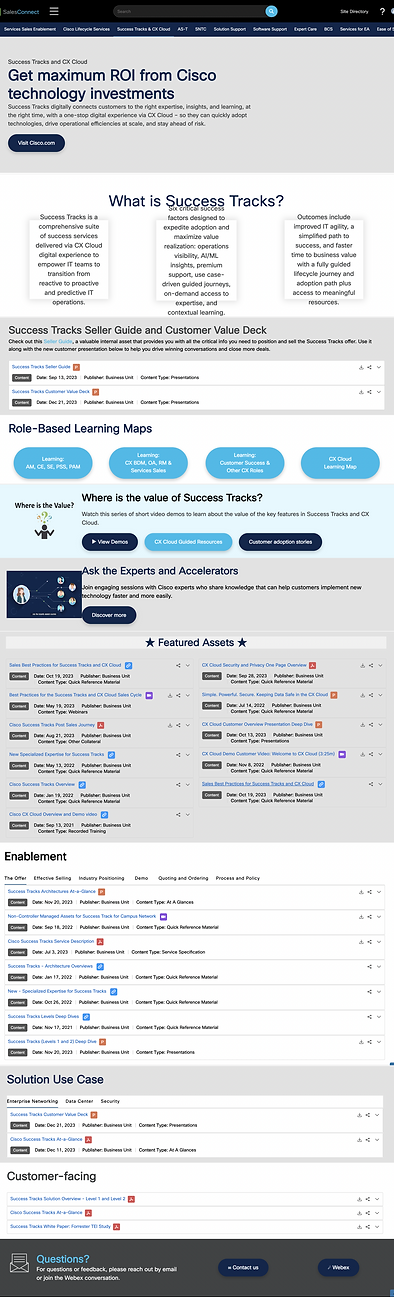
Before Design changes - Success Tracks
Related content is scattered across the page, forcing users to repeatedly encounter and relearn the same information in different formats.
An excessive use of colored sections on the page leads to confusion in visual hierarchy.
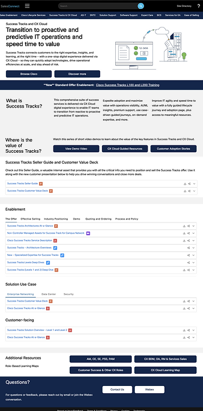
After - Success Tracks
Learning & Takeaways
I’ve gained a deep appreciation for the power of communication and collaboration. Within just three weeks, I was able to master a new CMS tool and successfully implement designs that were well received by the team. This experience highlighted the importance of adaptability and teamwork in driving successful outcomes.