Astellas Search
Redesign of Astellas pharmaceutical internal search engine
A complete redesign of the search landing page and improved usability of the search results page.
Project prompt – Responsive web design
Project type – UX/UI, Independent
My role – UX, UI, Research
Timeline – 4 weeks
Background
Astellas is a pharmaceutical company dedicated to improving the health of people around the world through the provision of innovative and reliable pharmaceutical products. It aims to maximize improvements in quality of life and to minimize the burdens they create.
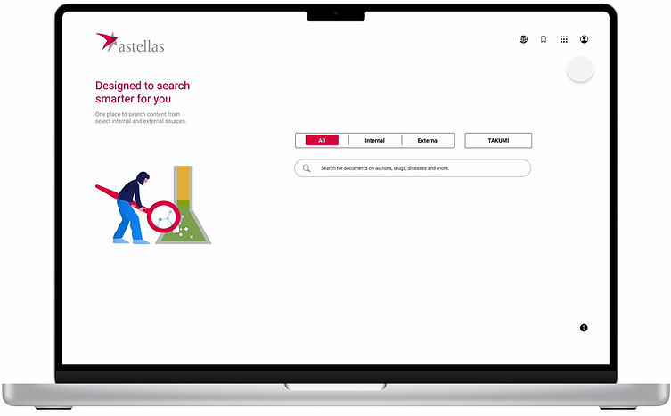
Among the many ways Astellas communicates this information is through pictures, graphics, design and words. This pilot program aims to upgrade Astellas Search User Experience with an approach combining the aesthetics of Japanese modernism with the airy feel of a Google search.
Objectives
- Redesign the search landing page within the constraints of the current functionalities
- Rethink UI and UX for the results page by prioritizing features and filters that users most use
Problem
Time consuming to source, review and analyze available clinical and drug data
Additionally, parsing through large amounts of information to find the relevant and key insights can
also be a challenging task
How I intend to solve this
Redesign the site within the limitations set by the current framework yet give it a whole new
identity which allows users to stay familiar with the functionalities minus the cognitive overload
Research Goals
User search pattern
Understand what users search for and how they go about performing this search
Understand what users find most valuable and most irksome about the process
Current Astellas behavior
Understand the successes and painpoints of the Astellas page
Determine the optimal information architecture for Astellas with proposed improvements
Deep dive into how other search engines compare to Astellas in terms of website architecture, filters, strategies for information display and functionalities.
I started this study by understanding and familiarizing myself with the Astellas existing site and comparing it against three prominent search/ resource management/ pharma websites. The primary focus was understanding :
1. Landing Page: prominence, display and hierarchy of search bar and other functionalities that may be important to the user.
2. Search Results Page: Display of search results, prioritization of filters and how we could integrate existing Astellas functionalities with possible new and improved functionalities that would remain consistent with newly designed site architecture, branding, and composition.
Methodology
Market Research / Competitive Analysis

1:1 Interviews
Interviews were
1. An open conversation about their current roles within the company, what their day to day roles involve and what they seek to achieve in terms of short term/ long term goals in their career.
2. An evaluation of Astellas existing site – users were asked to perform a search and were asked to vocalize their thoughts and observations on both the landing page as well as the results screens while doing so. Below were the notes made during the interviews.
Key Findings
Empathy is the holy grail of healthcare UX
1. When it comes to improving user experience on healthcare websites, we must always begin with genuine empathy and concern for the patient.
2. For a healthcare website to be truly user-centric and useful it must bring real value and benefits: saving time and effort, simplifying research and providing valuable features.
3. Prioritize and make it easy to access the most important information; make it shareable, downloadable, and printable.
4. Simplify their online experience by avoiding the use of complicated terminology, using acronyms and clinical jargon.
5. Provide information in a visual format with interactive tools.
6. Trust is paramount: Link to full clinical studies and case studies and cite reliable sources to reinforce all site content represents scientific, objective data.
Define
Site Map
Post interviews, I then began to evaluate and study the existing site architecture. With the objective of providing users with an upgrade and not a brand new learning experience I charted out the sitemap for our proposed design updates.
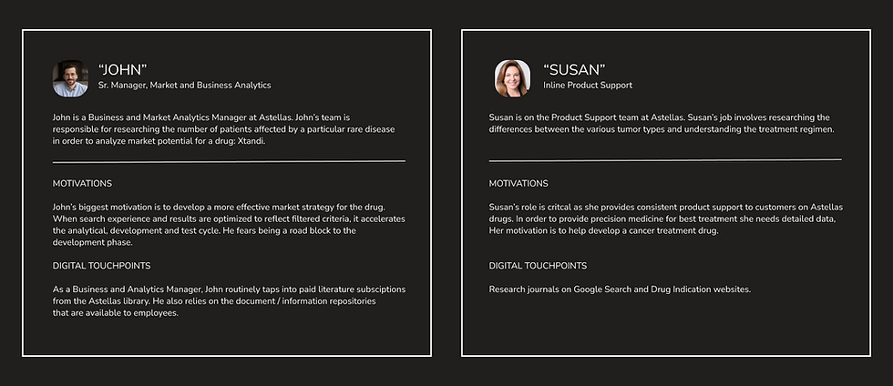
Persona
From the research, I came up with two different personas: John and Susan were created to represent a voice heard repetitively though the interviewing process. Frustration that too much information was presented with every search which means sorting out the contenders from the pretenders can be difficult and cumbersome. The overwhelming number of features increases the probability of users dropping out because of fatigue and for those that persist it causes frustration when they are trying to get to the primary functions.
Design
The design process centered around insights gathered from meeting our users and understanding their frustrations.
Insight 1: Users struggle to accomplish their goals because of significant usability issues, and overwhelming number of features.
Our recommendation: Trim down the number of features provided and focus on the key features.
Insight 2: Too many versions of the same document which are not verified.
Our recommendation: Consider adding document previews which enable users to view an image of a document without leaving the search results.
Insight 3: The site seems outdated and clunky.
Our recommendation: Simplify layout, introduce elements of freshness and modernize the website.


Sketch

Low Fidelity Wireframes


Design Decisions
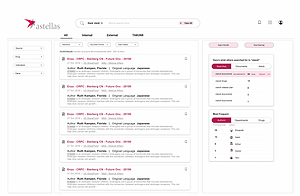
Document Results Page

Documents Preview Page

Documents Attributes Page
1. Improved text readability for overall better user experience.
2. Prioritized important information thereby reducing cognitive load and directing attention with colors and accent for a memorable online experience.
3. Eliminated the usage of varied colors of highlighted text which was proving to be more of a distraction.
4. Usage of filters in a more restrained but accessible way of drop downs so users can decide how much they want to see.
Test

Objectives
Participants were given a few simple tasks to perform:
1. Test out icons on home page (Profile, Key applications, My Saves, News)
2. Search for drug 'Xtandi' on search bar and navigate to the search results page
3. Select Filters
4. Bookmark a document
5. Preview document/ View attributes
6. Close view
Following the tasks, participants were asked to provide qualitative insight by assessing the home page and results page
Takeaways
Reconstructing a coherent information architecture was key!
Participants had no issues performing the tasks they were given since I had taken into consideration the fact that the experience would be fresh not new! I aimed to create a memorable online experience by prioritizing important information, reducing cognitive load and directing attention with colors and accents.
All participants commented on the ease and effectiveness of browsing using the revised Results screen and cleaned up filter menu.
The participants also agreed that eliminating the timeline feature on the results page directed attention to the results which is priority.
Multiple participants did ask where and how the language translation service (to Japanese) could be used.
Project Reflection
Working directly with the stakeholders and the users across different verticals within the company was challenging in order to build consensus on the outcome. Although Astellas has a coherently applied design system, the drawback lay in working within the constraints of this system. Obscuring data behind complicated menu systems eventually affects the customer using the drug. My primary intention was to reduce the amount of text on the page without compromising on the quality of the results. On further iterations I would like to build a portal where the users hear from real patients and caregivers through testimonies. Also, from researching other pharma websites, I understand that Integrated media helps to make content more readable. Images and videos are far more likely to be shared by readers.
With further revisions I’d edit the home page and challenge myself to tell the same story in a more condensed and visual format.